the 2020 job fair theme:
create your summer.
how it started:
We're the original Camp Canada - so naturally, we're all about being original. Of course, 'original' doesn't always mean 'first'. Originality is about unique, authentic self-expression - and it's more important now than ever. Canada is a place where being yourself is encouraged and celebrated - a place where you can find yourself in the wilderness.
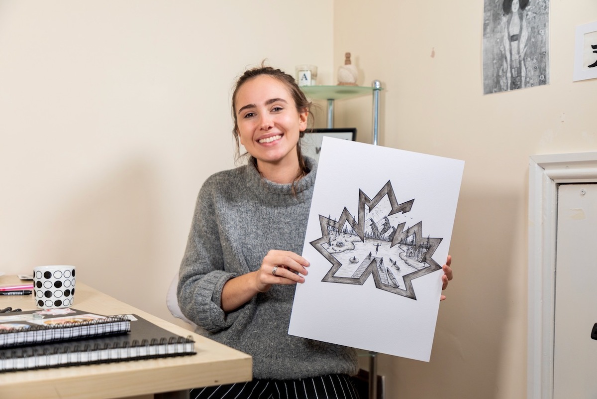
We wanted to create an original piece of art that would capture the natural beauty of Canada, and our hand-selected Canadian summer camps. Naturally, we thought we'd approach one of our participants, and ask them to create something personal to them. We got in touch with April, an artist and a 2019 Camp Canada participant from northern England, and asked her to design a limited-edition logo for us.
Our only request: it had to be handmade.
Wasting no time, April took our idea and hit the ground running. She grabbed the closest piece of paper, and started drawing immediately. You can see her initial ideas in the picture below.
April: "What camp means to me is the freedom to be who you are. I definitely felt like I was the most authentic version of myself - it was really rewarding. Camp means quite a lot to me."

April relied on her own memories for inspiration - luckily, she'd only been back for just over a month, so they were still fresh.
AH: "I could use my own memories of my summer. I wanted to include the things that made camp unique, and the things that I took away from being in Canada. It linked with what I'd already been working on - drawing animals, drawing nature. It was a perfect transition from the work I've already been doing - but now it's based on my authentic experiences and filled with that much more depth and meaning."
taking shape:
Before long, April's simple sketches had turned into a notebook full of intricate drawings. April took inspiration from several sources - Canada's rugged environment, it's rich wildlife, and most of all, her own experiences.
AH: "When I was given this project, the first image that came to mind was the skyline of the mountains, the trees, and the lake, the reflection off the water - that tranquil, peaceful vibe that you get from camp. I really want to incorporate that and bring it to life, with kids involved and different elements of camp - like a tent or a campfire. Things that you would see and think, 'that's camp'."

AH: "It was really helpful to have concepts behind each of the designs. For one of them, contrast was the concept, so I would contrast the stability and groundedness of the mountains with a bird, soaring free. For another, I used the four elements - earth, air, fire, and water - and incorporated all of them into the design."

the final designs:
April had several great ideas, so she decided to create 3 final drafts of the logo, and let us choose between them. Each piece was inspired by something different - and she gave each of them a name.
"wild"
April's passion for animals shone through in this piece, and she captures Canada's rich wildlife by cleverly stretching the boundaries. The scene is literally bursting with wildlife - the rustic wooden boards that make up the edges of the Camp Canada logo can't contain a bear and a raven. In the background are other animals like wolves and moose. It's all tied together by a compass, symbolizing her journey through the wilderness.
"lunar"
The most abstract of April's 3 designs, "Lunar" juxtaposes the Toronto skyline against the mountains and trees of the Canadian wilderness. The most prominent feature is the moon, which symbolizes both April's arrival and departure from camp. On both occasions, there was a full moon in the sky. The waxing and waning moons above and below feature the natural life cycle of the solar system, and our place in it.
"camp"
Inspired by April's experiences at camp in Ontario, "Camp" features mountains, trees, a campfire, and birds flying free of the logo's edges. The scene so accurately captures the incredible beauty of summer camp in the Canadian wilderness, but the symbology of the person taking the leap off the dock is what won us over.
Canada is a place to be free, to explore, to be your authentic self - and no place symbolizes this more than camp.
What started out as an idea became a work of art - an unmissable, unforgettable experience.
Of course, it was only possible because someone decided to take a chance, to embrace discovery, and to express themselves authentically. What followed was inspiration.
What happens next is up to you.
create your summer.
